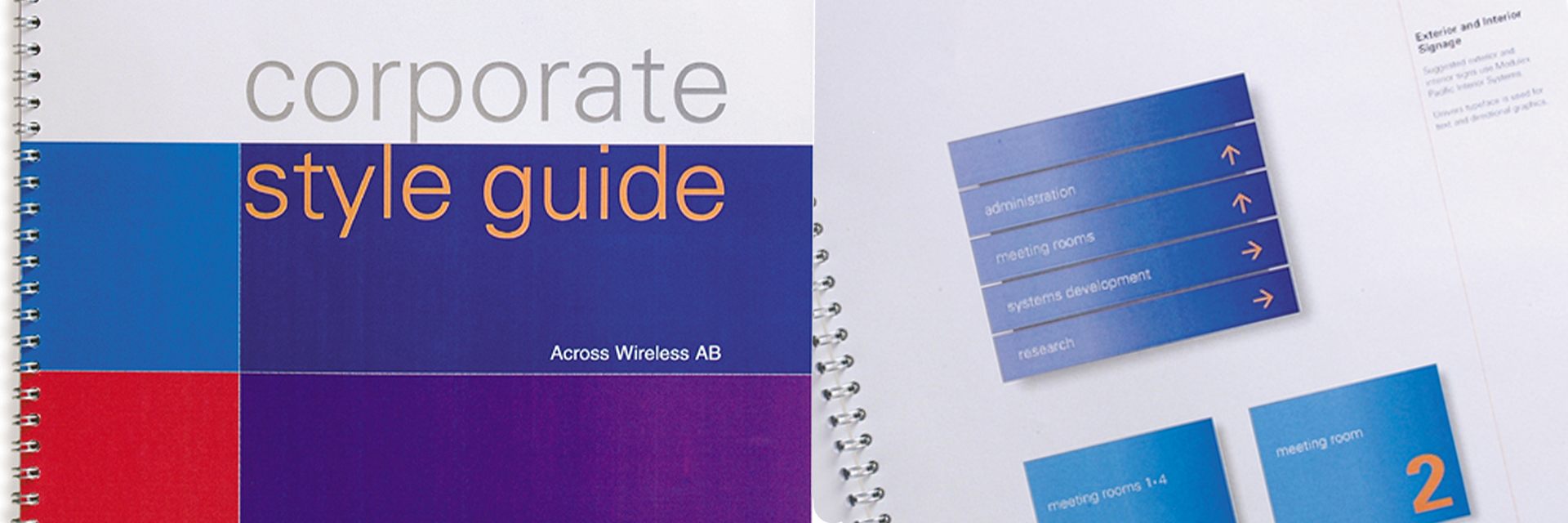
Why your brand identity needs guidelines
Your brand often constitutes a considerable investment, to maintain the high standards that have painstakingly been agreed it is worthwhile defining how the brands visual identity should be managed.
To help with this process, a comprehensive set of guidelines form a valuable tool that explains the fundamental rules and principles for the use of basic elements such as the logo colours and type. They often illustrate visually how the brand identity should be applied to the key aspects of marketing communication such as stationery and literature and website. All the hard work can be quickly diluted by logos that have been redrawn using the wrong colour.
Brand Guide Benefits
Consistency Benchmark
Guidelines become a benchmark for maintaining the consistent appearance, values and standards of the brand. It is a reference book for outside suppliers, internal specifiers or new staff. Everyone should be aware of its existence and know how to access it.
The rulebook
Your rulebook will set out all the parameters for the logo appearance, suitable applications, safe space, colour specifications for digital and print, selection of correct typestyles.
Recognition
By managing the use of the logo, its colours and applications even the style of imagery and layout, it establishes a consistency that becomes easily recognisable and synonymous with the business.
Adding Value
The more recognisable and consistent the brand becomes the greater the perceived value, adding the professional credibility of your business.
What is included in brand identity guidelines?
Logo Versions
A key component to the brand is how the logo looks, any clear space it should have and also any options such as black and white or use on a colour. Often it demonstrated what is not acceptable as a guide.
Typography
Guidelines will include the selected and approved typefaces, digital fonts as well as any other font families and sizes that are acceptable.
Brand colours
These are the colours that your brand uses they should be available in a digital format such as Hex colours RGB as well as print-based CMYK versions.
Application examples
Key examples are usually illustrated to demonstrate how the brand works across key business areas. These often cover stationery, website and if key touchpoint vehicles and signs.
Tone of voice
It is increasingly important to demonstrate the spoken or written language used within the business when communicating with customers and key stakeholders. These words and phrases help demonstrate brand personality and values.
Brand guidelines keep your brand consistent, recognisable, and safe and define the parameters for maintaining your investment.
So, if you are looking at defining your brand consistency create a set of guidelines. If you need any help – No problem, just get in touch
YOU MIGHT ALSO LIKE
BLOG
- Are your customers holding you back? »
- Why your brand needs guidelines »
- Getting the design brief right »
- 10 Branding terms »
- Brand Architecture
PROJECTS
LIKE TO TALK TO A BUSINESS FOCUSSED DESIGN AND BRAND AGENCY?
CALL 0754 522 7151
